If you run a blog, adding sharing icons is a good thing to do. Encouraging others to share your content via social media broadens your reach, and can expose your content to new audiences.
From a user standpoint, I personally prefer sharing icons to be embedded on a page because I don’t always know what to say about an article or resource I’m sharing. Having that content pre-written for me is really nice! Making sharing easy for people is the best approach — someone can share your stuff within a matter of clicks. Much easier than a couple clicks, a bunch of keystrokes, and some more clicks!
1. Use a Widget Made by the Social Media Service

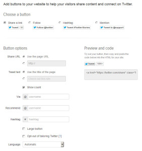
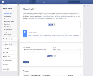
The Facebook like button, the Twitter follow button — you’ve seen them before. They’re usually made from code that the social media service itself provides. You can usually find this code somewhere in the website.
Sometimes it’s called embedding, sometimes it’s called a widget, sometimes something else. Googling “twitter share button” or “facebook share button” is usually enough for you to find what you’re looking for!
Advantages
- Super easy. Virtually anyone can do this, as it’s usually a matter of copy and pasting in the right place.
- Sometimes come with extra functionality (e.g., Facebook’s posts feed) that’s tough to implement simple social media buttons.
Disadvantages

- You usually can’t customize them much, if at all. Maybe you can change the colors or the number of Facebook posts to show, but you can’t really get much more than that.
- Sometimes these things come with extra scripts — this is especially the case if the widget is performing some kind of special function like showing your latest tweets. These need to load, naturally — so that can cause a tiny bit of extra overhead on your page.
2. Use Your Website Service or a Plugin

Alternatively, if you’re on something like a hosted WordPress — you can find about eight hundred and two plugins to accomplish your objective. On self-hosted WordPress, one of the easiest ways to implement sharing icons is via the Jetpack plugin. Jetpack can easily add icons at the bottom of posts, pages, and similar. You can also do a little bit of custom CSS to implement icons where you’d like them, too.
2. Simple HTML and Images
In this method of implementing social media icons, you go into Photoshop and hand-create icons — or download a set from somewhere else.
Advantages
- Relatively easy, and may be easiest for you if you have extensive Photoshop abilities but you’re shaky on code. There’s nothing wrong with making fancy Photoshop icons if that’s what you’re most comfortable with! It’s also easier to acheive some effects in Photoshop or similar than via code.
- No CSS needed, you’re only writing HTML when you create the icons.
Disadvantages
- Each image is an HTTP request, meaning each image slows down your page ever-so-slightly.
- Images are harder to create and maintain. If a service changes its logo, you either have to get a new logo image or keep using an outdated (and soon to be less-recognizeable) logo.
- It may be hard to find an icon set with exactly the icons you need and the look you want. This trouble increases as you use different services.
3. CSS Sprites
Advantages
- Since all your images are contained in one image, only one HTTP request, meaning your site is slightly faster.
- If you have to edit the look of multiple icons to change their logo, you’re only editing and re-uploading one file, which is much easier.
Disadvantages
- They’re not extremely hard to code for an intermediate CSS coder… they’re just seriously tedious if you do it manually and by hand. I wrote code for social media icon sprites exactly three times before I was completely over it and never wanted to do it again.
4. Icon Fonts
This is a more modern way to include your icons. Be aware that they may not display in all browsers.
Advantages

- Still another HTTP request… but by smartly including your fonts, the browser will download only what it needs. If the browser can’t display an SVG font, it skips downloading it. Browsers have gotten pretty smart!
- You can include only the icons you need. Your client doesn’t have YouTube? Why bother including their logo into the font? This makes the font much, much smaller and much faster to download. Instead of including a 1,500 character logo icon font, you can simply include the three logos you actually need, minimizing the size of your icon font.
- Flexibility. With SVG icon fonts, you can scale to any size. You can also change the color of your icons depending on where in your layout they will be. Neat, huh?
Disadvantages
- Editing the fonts usually requires you going to the icon generator you first used and regenerating the icon font — unless you have the capability of saving your project and editing it later. It’s best to include only icons you’ll need, minimizing the size of your icon font. As aforementioned — no need to include 1,500 characters if you are only using three!
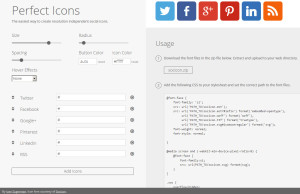
- You do generally have to code these yourself. Some services like Perfecticons (my personal favorite generator!) make it easier for you, but any customization you’d like to do (e.g., changing colors dependent on theme position) must be coded yourself. If you don’t know CSS, this may not be so feasible for you.